Deploying Next.js app on Netlify [Building Personal Blog Website Part 4]
Published on 8/30/2022, 12:00:00 AM
This is the fourth part of the "Building Personal Blog Website" series. In the series we'll setup a free CMS to hold our blog content on Railway, create a React app with Next.js' static site generation and TailwindCSS to present the articles and host it on Netlify.
Now it’s finally time to put your app online!
First you need to push your Git repository (create automatically while creating Next.js app) to GitHub. Go to github.com and log in (or create an account if you didn’t do this already). Create a new repository clicking on the upper right corner:

Add the name, decide whether the repository should be private or public and click Create. You should see something like this

Now go to the Terminal and in your app’s root folder commit all the files (if you put your environment variables into .env file then remember to add it to .gitignore). Now let’s push your repository to GitHub:
git remote add origin YOUR_GITHUB_REPOSITORY
git push -u origin main
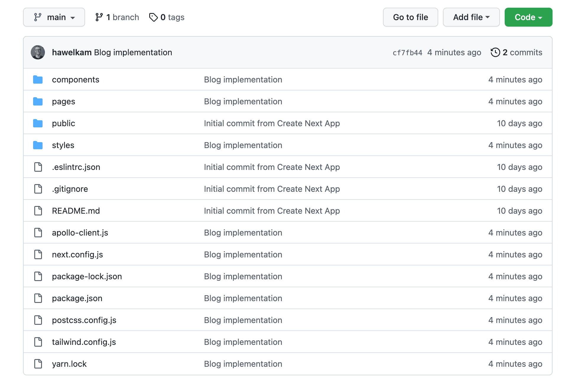
When it’s through you should be able to see your files in GitHub:
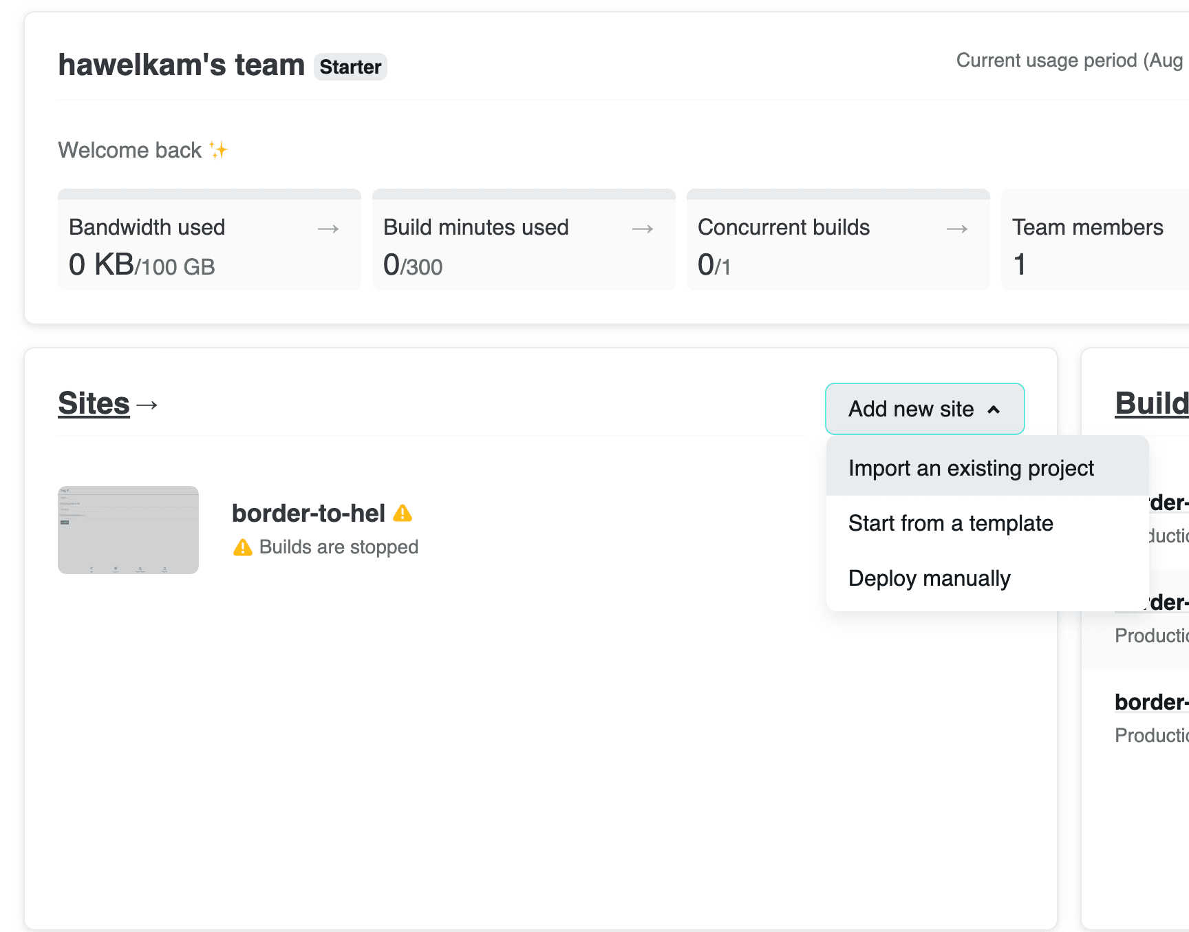
Now you’re ready to deploy it to Netlify. Go to netlify.com and log in. I suggest logging in with GitHub. You should land on your dashboard where you can create a new site:
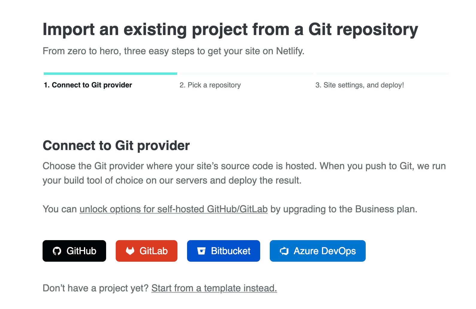
Select “Import an existing project” and then connect to GitHub and select your repository:
You should see something like this:
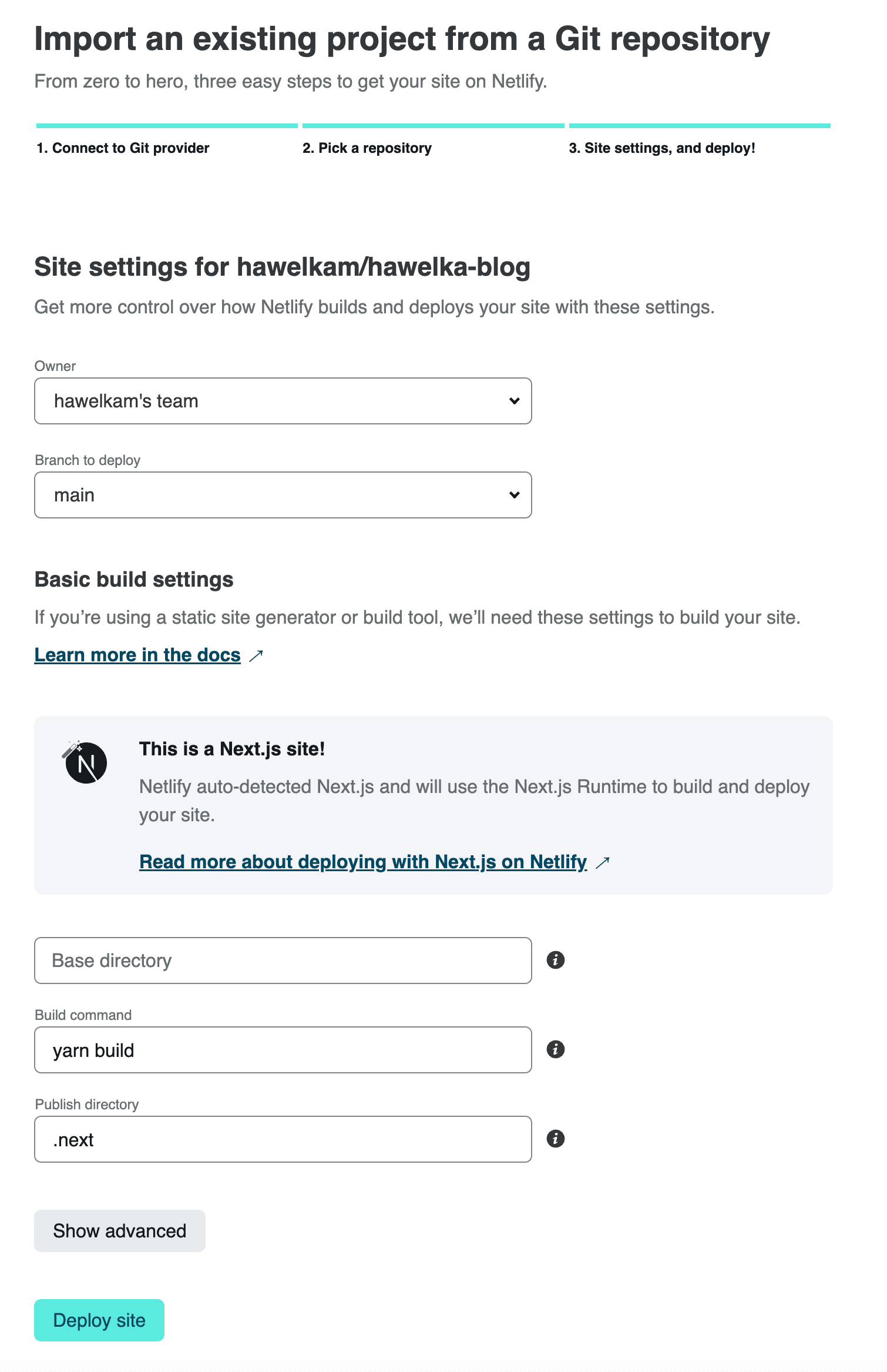
Leave all of the default values and click Deploy site. You’ll see that deployment is in progress. Wait a few minutes until it is done.

In case the deploy fails just click on the failed deploy and try doing it again. Railway sometimes has an issue of rejecting connections at the beginning.

When it’s done you’ll see the address of you new website:

Go to this address and you should see your work online!

Now whenever you push something to your repository Netlify will automatically rebuild your app. Remember! Changing something in your CMS does not trigger rebuilding so if you want to have fresh content - you’ll have to rebuild your app on Netlify manually on the Deploys tab on your Netlify dashboard:

Let’s make some changes to the site’s layout to see this automatic rebuild in action.
What your site lacks as of this moment is a nice navigation bar, basic footer and some responsive adjustments for the mobile. Create two new components in components directory:
Navbar.jsx
import Link from "next/link";
import React from "react";

const Navbar = () => {
  return (
    <nav className="z-0 w-full">
      <div className="z-10 bg-blue-500 shadow">
        <div className="max-w-7xl mx-auto px-2 sm:px-4 lg:px-8">
          <div className="flex flex-col sm:flex-row items-center justify-between gap-4 p-2 font-mono">
            <Link href="/">
              <a className="flex-shrink-0">
                <h1 className="font-bold text-xl uppercase text-white">
                  My Personal Blog
                </h1>
              </a>
            </Link>
            <div>
              <div className="flex gap-2">
                <Link href="/">
                  <a className="px-3 py-2 text-sm font-medium text-white hover:underline hover:underline-offset-4 hover:text-white hover:font-bold transition duration-150 ease-in-out cursor-pointer focus:outline-none focus:text-white focus:bg-gray-700 ">
                    Home
                  </a>
                </Link>
                <Link href="/about">
                  <a className="px-3 py-2 text-sm font-medium text-white hover:underline hover:underline-offset-4 hover:text-white hover:font-bold transition duration-150 ease-in-out cursor-pointer focus:outline-none focus:text-white focus:bg-gray-700 ">
                    About
                  </a>
                </Link>
                <Link href="/contect">
                  <a className="px-3 py-2 text-sm font-medium text-white hover:underline hover:underline-offset-4 hover:text-white hover:font-bold transition duration-150 ease-in-out cursor-pointer focus:outline-none focus:text-white focus:bg-gray-700 ">
                    Contact
                  </a>
                </Link>
              </div>
            </div>
          </div>
        </div>
      </div>
    </nav>
  );
};

export default Navbar;
and Footer.jsx
import React from "react";

const Footer = () => {
  return (
    <footer className="bg-blue-500 py-8 w-full">
      <div className="flex flex-wrap justify-center">
        <div className="text-sm text-white font-mono font-semibold py-1">
          Copyright © YOUR_NAME 2022
        </div>
      </div>
    </footer>
  );
};

export default Footer;
Now adjust your pages/_app.js file to use those newly created components
function MyApp({ Component, pageProps }) {
  return (
    <div className="flex flex-col items-center bg-white">
      <Navbar />
      <Component {...pageProps} />
      <Footer />
    </div>
  );
}
And finally make small changes in pages/index.js to better display the post list on various screen resolutions:
export default function Home({ posts }) {
  return (
    <section className="grid grid-cols-1 sm:grid-cols-2 lg:grid-cols-3 gap-4 my-8 mx-4">
      {posts.map((post) => (
        <BlogPostPreview post={post} key={post.attributes.slug} />
      ))}
    </section>
  );
}
Now commit all of the files and push the changes to GitHub.
git push
Wait a few minutes and check your website hosted on Netlify.

Looks better, doesn’t it?
And that’s it for today - your website starts going somewhere! In the next part of the series you’ll implement a simple Show all posts for specific Tag feature. See you then!